Thursday, September 29, 2016

I'm going to squoosh three posts into one bc I don't want to make 3 posts

Okay so I need to make a critique for my 3 assignments I've done in digital art. Cool beans. The assignment says to make it into three posts, but I don't really think that's necessary. Well I guess I'm just going to get started on this. 

Critique #1
Description: I see a lot of things, very cluttered. I see orange circles overlapping, I see striped circles making a trippy effect as they overlap. I see a grey box with a light blue outline, I see a bunch of rectangles of different colors, ellipses with gradients, a spiral that looks like sausage links, and a calligraphy line.

Analysis: I see line being used, the broken lines in the sausage links, thick and thin lines of different colors being used on the shapes. Obviously shape is being used, pretty much the whole drawing is just individual 2D geometric shapes coming together to make chaos. Space wasn't really thought about here. With value, you can see the gradient ellipses getting lighter as it goes inward, somewhat making a 3D effect, but not really. I don't really see any texture other than the lack of it. Color is obviously used here very haphazardly. The stuff in the background is mostly bluey-greens, so I think I may have accidentally put emphasis on the orange overlapping circles. The best way I could describe the color is complementary. Meh. Not much pattern, but the stripes in the overlapping circles could be considered pattern, as well as the sausage links I suppose. Not really any contrast except the back background is white, while the subjects are colored and pigmented and how the shapes in the back are bluey green and the shapes in the front are orange. Like I said before, accidental emphasis was put on the orange circles because of the contrast, size, repetition, and placement. If I had cropped the image at the end of the striped circles, it would be in optimal focal point position. I really  don't see any balance here. The proportions kind of portray a depth to the picture with the orange circles being closest and the sausage links being the furthest. There is practically no harmony in this photo that I can see. I think there is at least some movement in the circles (both striped and orange) with their flow.

Interpretation: through the eyes of a viewer and not a creator, I see chaos in this picture, which funnily enough is how I felt at the time. The program gave me extreme frustration and was very difficult to get it to even work. Chaos was happening in my head. I guess it kind of went onto the canvas, somewhat unintentionally. 

Evaluation: Yes, this piece did technically fulfill the requirements at the time, but no, it did not fulfill my wants. It was difficult enough to even get the program to work; I did not want to spend effort on making it look pretty. In a way, I was somewhat purposefully making it look shoddy out of spite of the program. I had a vision, but it just couldn't be fulfilled on canvas.

Critique #2
Description: I see what appears to be a text book cover for earth science. Grey border and a sandy background. It has elements of nature, or the earth's spheres, put into circles with white halos around them. The author is Eenk Skapé Sucz and the publisher is Krapprogram Publishers. The publisher is put on a dark blue, uh, rectangle? The words "Earth Science" are just the outlines with a transparent inside and they have a gradient that goes diagonally. The text for the title and author are both an ivory sort of creamy and yellowish whitish color.

Analysis: Line is used for the title and all the circles (all the circles have a thin solid border.) Shape: all pretty geometric. The letters of the title are obviously pretty organic if you want to count those. Space: I guess not really much that means anything. The space between the shapes are occupied by sand. Value: I mean, obviously the royalty free images have shading in them, so yeah. Just natural value. Texture: the sand is very gritty and sandy, the ice in the bubbles are very slick and shiny (broken up by cracks), the water in the bubbles are, you know, watery. Color: lots of harmonious colors that contrast well. Emphasis: bubbles and whatnot Balance: a bit between the bubbles being different sizes Proportion: There's size differences between the bubbles, but also depth, suggesting they're overlapping. Harmony: eh Rythym/movement: eh

Interpretation: Earth's spheres are important and beautiful at the same time.

Evaluation: I met the requirements of the assignment while making a good looking textbook cover that I kind of like. I also got revenge on the program with the author and publisher names.

Critique #3
Description: I see an anime-esque man (Dwyer from fire emblem     (・ω・)) traced in a digital art program.

Analysis: line: thin, organic Shape: organic Space: eh Value: shading in the upper face and under the nose, highlights on the hair and eyes Texture: smooth throughout Color: just the colors that were used in the original artwork Pattern: eh Contrast: between the upper face and lower face Emphasis: hair? Balance: eh Proportion: eh Harmony: eh 

Interpretation: not really any interpretation to it. It's just a tracing of a character.

Evaluation: I fulfilled assignment requirements and made something decent looking in inkscape, but also made something I find morally wrong (tracing artwork), but I didn't really want to trace any of my art so whatever.

I'm tired bye

-Dan Fenn (Blurry Grawlix)

WELL THEN

While delving into the depths of the photos on my computer, you know, for old times' sake, I found this. This was my actual first piece of digital art ever. This was actually an assignment for my 8th grade English class. We were doing a book report (I did a book called "It's Kind of a Funny Story." Great book btw, probably my 2nd favorite ever) and we had to make a comic representing the book. If you look in the 6th panel you'll see it's kind of faded, that's because I screenshotted it while the program was not responding so I wouldn't lose any work. I spent sooooo long on this. To be honest, it's pretty crappy. But what do you expect, it was my first time using the program and the first time I had used my Wacom since I gave up on digital art because I couldn't find a viable program that was free. I have come so far :)

Pretty impressed by my progress; you can see my latest big drawing to the right of the screen

-Dan Fenn (BlurryGrawlix)

Tuesday, September 27, 2016

Stock photo representation of me right now

Here's a default dude stock photo which represents me looking at what I need to do for art.


Here's a default dude stock photo which represents me after seeing the line shown above in the assignment:


I'm just going to do my 3 assignments I've done for class and not any of the work I've done in my free-time. If I did all of my work, that would be a lot of posts.

Thursday, September 22, 2016

Sneaky Sneaky Sneaky Peeky

Sneak peek on the animation I'm going to do having my good friend do voice acting.

I SHALL SAY NO MORE!
-Dan Fenn (BlurryGrawlix)

Wednesday, September 21, 2016

Inkscape Volume 3

9/19/16, 2:28 PM
This has nothing to do with Inkscape, but the tutorial that I'm watching is painfully boring and long winded. 30 minutes! I'm only 4 minutes in and I'm already dying of boredom. Uggggghhhh, doesn't help that I'm tired anyway. I might actually fall asleep.

The first time I used the pencil tool, the program crashed. That was the first time I used Inkscape. Still watching the video, actually fell asleep.

No exaggeration, I am going to have to watch this video later. I literally cannot stay awake watching this. Luckily the assignment isn't due until Thursday. I will continue this journey tomorrow, or after I take seven "Five Hour Energy"s just to stay awake for this video.

9/21/16 2:45
No more putting this off. I can't put it off any more. I have to do this. I'm going to sit through this 30 minute video.
I love the way this lady says "node". It's pretty adorable.
I keep zoning out and having to watch certain parts again.
This is painfully slow.
Almost 1/3 of the way through....
I'M SO FREAKING BORED.
Just past half way...
I think I'm watching broken record.mp4
SHE JUST KEEPS REPEATING HERSELF THIS IS SO BORINGSKJFOIAHOIFHSIHF
Captaaaaaaaain OBVIOUS
I don't think she's going to say anything else important at this point. She's been repeating herself for the past 10 minutes.
3:15
That video was about as helpful as a sack of rocks being put in my brain.
Now to actually start using the stupid program ;-;
mmmm don't you love how this program opens it looks so good 10/10 would open again
I'm going to be tracing the sprite of Dwyer when he's visiting your house. Here is reference
cute relatable mmm that is the child that is gr8 gr8 butler can buttle better than you, Jakob 
Already having frustrations! I think we should give this program an award. 
3:30
It's doing that thing where nothing will work again :)
4:22
I've created a monster.
I got a little off track...
BACK TO WORK!!

5:00

I bet he can buttle better than you.

6:45
I THINK TRYING TO DO THE HAIR WAS A MISTAKE. IT'S BEEN ALMOST 2 HOURS.
Okay so I'm not going to delete the hair, but I'm not going to complete it because it's taking too darn long.
CLOSE ENOUGH
This took way longer than it should have. I'm (d)on(e)ion rings.

Later, losers
-Dan Fenn (BlurryGrawlix)

Friday, September 16, 2016

My fictional son

This is Dwyer, from Fire Emblem Fates.
     I really love this character, and relate to him so much. He's so ethereal (anyone from my English class knows I'm going to use this word every day I love it where has this word been all my life) and precious and he's takes a lot of naps, much like me, and he is just so adorable and he makes good coffee and tea apparently and I love his design and everything and his father in the game is really mean to him so I feel like I should protect him and *inhales* HE'S JUST SO AMAZING. 
     So I wanted to make this picture more of a sketchy, unpolished kind of thing, but my perfectionism made it look pretty sharp. It is monochromatic and I do like that. I will say that this is in my unfinished art folder, so I'll probably do more work on it, maybe add a neck and shoulders. 


“I'd rather just have a cup of tea and watch, if you don't mind.”


-Dan Fenn (BlurryGrawlix)


[the quote is from the game, said by Dwyer]

Monday, September 12, 2016

The good news and the not so good news but it's not necessarily bad news by any means

I just found out some good news. I don't have to use Inkscape this week! (cheering sound effect) The problem with that (AKA the not so good news) is that I'm not obligated to do any art, considering there's nothing I'm going to be graded on this week. So that may or may not mean that I'm not going to work on anything a whole lot. I probably will because I do art all the time in my free time, but this week I don't feel very pressured to get a piece out. So yeah. I'll keep whoever actually reads this blog updated.

FYI: All digital pieces I do are in Medibang Paint (a free and wonderful program) unless explicitly stated otherwise. Medibang paint is completely free and it is my favorite program for art, and I've tried a lot of programs. If you're interested, the download link is here.

My next piece I'm going to start will probably be some sort of fan art of Dwyer from Fire Emblem: Fates.

Stay tuned
-Dan Fenn (BlurryGrawlix)

Sunday, September 11, 2016

Loaf o' Cat

My soul was having art withdrawal symptoms so I did a really quick sketch (like seriously 10 minutes) of this little coot (I call cats coots) loaf. You should Google "cat loaf". You won't be disappointed.

I'm going to go sleep some more
-Dan Fenn (BlurryGrawlix)

Friday, September 9, 2016

I'm really tired so here's a stupid inkscape robodog

So I made this from scratch in Inkscape and really tried to make it look cool. It's pretty cute, but take this and compare it to my last drawing. Okay, now take into consideration that my last drawing took a lot less effort than this thing. *sigh* I did this for practice and maybe it will fill out the next assignment requirements?

Something to note about Inkscape that is a big deal but I didn't know until now is that it's not compatible with tablet pressure sensitivity. At least not by default and I'm not willing to go into the settings to try to set it up and calibrate it. For most of these things I've done in Inkscape I've been using the mouse until I used the calligraphy pen to do my initials. One of the standards for art programs I use is that it has compatibility with tablet pressure sensitivity, and I don't have very high standards. Oh well I guess. 

As always,
-Dan Fenn (BlurryGrawlix)  

Wednesday, September 7, 2016

Grayscale girl gets a makeover

Here she is in full color. So here's what happened when I was coloring it. I started coloring it and originally her eyes were teal and her lips were purple. I then was like, "huh, she kind of looks like Hannah from black butler." At the time I didn't have her hair colored or even her shirt colored so yeah. I then was like, "well since it already kind of looks like Hannah, maybe I'll make it into fan art." But then I would have to cover one of her eyes and darken the other one and the hair wouldn't go a light enough color so I decided not to do a Hannah fan art. The concept of black butler gave me the idea to make her a demon, so I made her eyes red and gave the right eye a contract seal. In this process I also made her nails black and her shirt black. At this point I wasn't sure what to do with the hair so I asked my friend and they said to do it purple, so that's what I did. I kept the hair un-shaded like I did in the original, but I did play around with blueish highlights. I think it turned out okay, but it probably wouldn't have if she wasn't a demon. The background has a blue tint kind of because that's what I was told to do in a tutorial on how to color a grayscale painting and I didn't want to change it back so I just left it. I don't think there's much else to say about it. In her contract seal it says something in Latin that I translated through google translate, so it might not be accurate. I think I typed in soul, so whatever google translate told me soul is in Latin is what I put. I'm pretty tired and done with art for the night.

Tired bean is going into a burrito with a blanket tortilla,
-Dan Fenn (BlurryGrawlix)

Inkscape strikes back

Like the first time I used Inkscape, (and what I thought to be last... *Sigh* I'm giving it another shot. Again, not excited. I reinstalled it so hopefully this time it will work at least a little better? Idk, I've heard from other people that it's been wonky for them too.) I'm going to document my progress and uh, hopefully I actually make progress this time. I'm really nervous and not excited, but you gotta do what you gotta do I guess. I should totally take a picture of the face I'm making while typing this. I haven't looked at myself but I know my brow is furrowed with worry and I'm pretty sure I'm scowling, but I have a RBF (have to censor that) so idk I think I'm always scowling. (Took a picture, I look scary. And angry. TO BAD FOR YOU GUYS I'M REMAINING ANONYMOUS [at least not showing my face {but you could probably find a picture of me somewhere so idk}]) I think I'm subconsciously stalling my impending and inevitable doom from this program. I guess I'll just start.


2:41 PM
I've opened the program and I'm so nervous that it's totally not going to work, but uh, I'm going to go into the window now. Wish me luck...
Still the same outdated layout I know and... yeah. Shapes are working, but they're not the default even though I erased my settings when I uninstalled the program. Instead of a blue rectangle with a black outline, it's a pure black rectangle with rounded sides? I guess I'll fiddle around with it. I'm really relieved it's not doing the bullheck it was doing last time. (And I'm hoping it will continue to work)
I'm also realizing that most of the time doing the tutorial was just trying to get it to work and not actually learning anything, so I'm going to reference the tutorial a lot I'm guessing.
My stomach starts hurting when I'm stressed. It's definitely starting to hurt. 

3:08 PM
Progress is being made and it's going surprisingly well! This project isn't my, uh, cup o' tea, but I'm working on it. I've been fiddling around with it and I think I have a good start.
I mean, it's a start. It's a start.
3:50
I've just been working and suddenly the program without warning just closed. No message or pop up, it just closed, as if I had manually shut down the program with alt+f4 or with a task manager. I'm pretty sure my progress is all just gone. I have no idea what happened. I'm so confused... and sad... I had hopes for you Inkscape, and yet again, you let me down. I really have no clue what happened. It just closed without warning and all at once. I guess I'll have to start from what I screenshotted or something... I don't know... 
I opened the screenshot (seen above) and it's really low resolution despite being saved as a png, but I don't really have any other options. I'm so disappointed, because it was working so well! *sigh* Inkscape never fails do disappoint.
It even got rid of my custom patterns. That's hecking great.
4:05
I did a little more and I luckily saved it this time, but I just tried to zoom to show my mom how vector works (I didn't even do it in rapid succession because I know this program can't handle it) and this piece of poop program crashed.
I CAN'T DO THIS
4:15
I took a little break. I'm going to try again...

5:05
You know what? I filled out all the requirements for the assignment. Except for the having fun part. I definitely did not have fun, but the program mostly worked how it's supposed to if we ignore the crash and the sudden closing. I took out a little frustration on the publisher and the author of the science book. 
So much for saving it as a png... Like last time when I tried to save it as a png, this is not what the actual thing looked like.
This is what it's supposed to look like. I hate this program.

It gives you an option to save it as a png, but you have to export it to actually get it to work. That's kind of stupid in my opinion.

Well, here's Earth Science by Eenk Skapé Sucz, published by Krappprogram Publishers. I think it's Dutch or something. 
(FYI: the photos I used for the bubbles are all from a royalty free stock photo site)

Since the program worked as it's supposed to (I refuse to say it works well) and it only crashed twice, I'd give it a solid 4.9/10. Hey, that's more than double the score of last time. Still not a good program though.
Like last time, it's not fun like doing it with other programs is. It doesn't feel like I'm creating something... It just feels like I'm making shapes and filling them in with patterns. It's not creatively engaging or even what I define as digital art. I dunno, I feel like I would have a lot more fun in another program. I will give it props for being good and somewhat easy for making stuff like this if you need something like this; however, it's just not... artsy enough for what I usually do, if that makes sense.

Not necessarily frustrated, but not happy either,
-Dan Fenn (BlurryGrawlix)

Post Script for Mrs. Girot,
I don't know who you lost, but I genuinely send you sincere condolences. May they rest in peace.

I failed so here's a snake appreciation post

I started to color my last grayscale drawing, but I lost all the progress that I did. So very sad, but I'm going to fix it with a snake (mostly ball python) appreciation post. Celebrate accidents with snakes, that's the thing to do. If you're scared of snakes, you're crazy, but you probably shouldn't look, BUT THEY'RE SO CUTE SO YOU SHOULD TOTALLY LOOK AT THEM ANYWAY. All photos are found on Google, but I'll add original sources in footnotes if I can. 

Can you tell me genuinely that this is not adorable? Like, seriously!! THEY HAVE PUPPY LIPS!!1
Image result for ball python face
This little guy I'm pretty sure is an albino morph. He's a stressed little guy, shown by his rolling up into a ball. Poor little guy ;-; He's super cute still. Best wishes for him ^_^2
Image result for ball python face blizzard
I looked up blizzard morphs (because they're hecking beautiful) and this showed up so I'm pretty sure it's a blizzard morph (I checked and it's actually a leucistic morph). He/she is so beautiful. Look at him/her! So cute and beautiful. I think it's very kawaii, but if you think it's kowai, I respect your opinion, and if you think my Japanese skills are terrible, you're right because I haven't taken any classes.3
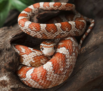
Image result for corn snake
Here's a corn snake. I know very little about corn snakes, but this guy is so cute. I saw one at a pet store and he was so cute and burying himself and it was so cute. Like I said, I know very, very little about corn snakes.4
Image result for are cobras venomous

Yeah cobras are venomous and whatnot, but they're still cute, don't you think? He's cute from a distance. Looky but no touchy. Okay, just read that he eats other snakes and small pythons, which is hecking rude, but it's the circle of life. It also says that "when confronted, this species quickly attempts to escape and avoid confrontation" but becomes very aggressive if continuously provoked, at which I say "saaaaaaaaaaaaame." I have mixed feelings on cobras, the negative parts being that he eats other snakes and that he's venomous and venom is hecking scary.5


Even if you don't think snakes are cute, don't you think they're relatable? Don't hate, relate. Like, ball pythons are just stressed out and scared little beans that curl up into balls when they're stressed. IS THAT NOT RELATABLE? Cobras try to avoid confrontation, but if they're continuously provoked they become very aggressive. I dunno, I really relate.

Don't hate, relate.
-Dan Fenn (BlurryGrawlix)

1https://www.pinterest.com/kirstenkerley/ball-pythons-cute/
(I couldn't find the original source, but this is the source on the Google image)